Ինչպես ցույց տալ տոկոսը կարկանդակ գծապատկերում Excel-ում – Ամբողջական ուղեցույց
In Excel, pie charts are powerful tools for visualizing data distributions, allowing you to quickly grasp the relative importance of different categories at a glance. A common enhancement to these charts is displaying percentages, which can provide clearer insights into the proportions each segment represents. This tutorial will guide you through different methods of adding percentage labels to your pie charts in Excel, enhancing the readability and effectiveness of your data presentations.
- By changing the chart styles
- By changing the overall layout of the chart
- By adding the Percentage label
Show percentage in pie chart
In this section, we will explore several methods to display percentage in a pie chart in Excel.

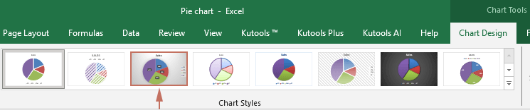
By changing the chart styles
Excel offers a variety of built-in chart styles that can be applied to pie charts. These styles can automatically include percentage labels, making this a quick and straightforward option for enhancing your chart's clarity.
- Select the pie chart to activate the Գծապատկերային գործիքներ ներդիր Excel ժապավենում:
- Կարդացեք Գծապատկերների ձևավորում ներդիրը տակ Գծապատկերային գործիքներ, browse through the style options and select one that includes percentage labels.
Ակնարկ: Hovering over a style will give you a live preview of how it will look.
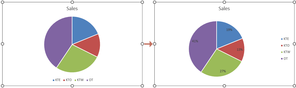
Արդյունք
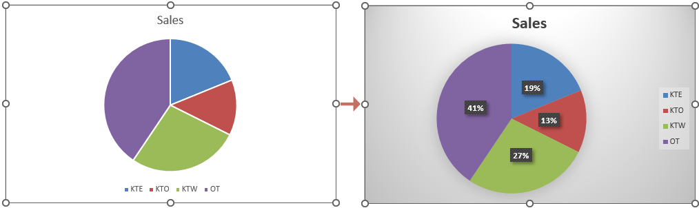
The desired style then applies to your selected pie chart. The percentages should now be visible on your pie chart. See screenshot:
By changing the overall layout of the chart
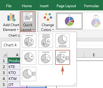
Changing the overall layout of your pie chart can give you more control over which elements are displayed, including data labels that can be formatted to show percentages.
- Select the pie chart for which you want to show percentage.
- Կարդացեք Գծապատկերների ձևավորում ներդիրը տակ Գծապատկերային գործիքներ, Սեղմեք Quick Layout drop-down list, and then select a layout that includes percentage labels.
Ակնարկ: Hovering over a layout will give you a live preview of how it will look.
Արդյունք
The percentages should now be visible on your pie chart. See screenshot:
By adding the Percentage label
For a more direct approach, you can specifically enable and customize percentage labels without altering other chart elements. Please follow the steps below to get it done.
- Right click the pie chart that you want to show percentages, and then select Ավելացրեք տվյալների պիտակները համատեքստի ընտրացանկից:
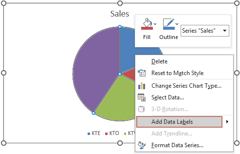
- Now data labels have now been added to the chart. You need to right click on the chart again and choose Ձևաչափել տվյալների պիտակները աջ կտտացնելու ցանկից:

- The Ձևաչափել տվյալների պիտակները pane is now displayed on the right side of Excel. You then need to tick the Տոկոս տուփի մեջ Պիտակների ընտրանքներ խումբ:
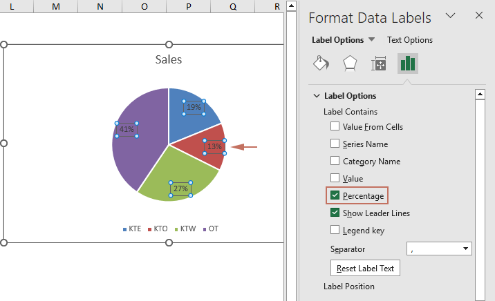 Նշում: Ensure the "Տոկոս" option is ticked. You can then keep any label options you need. For example, you can also select "Category name" if you want both the name and percentage to appear.
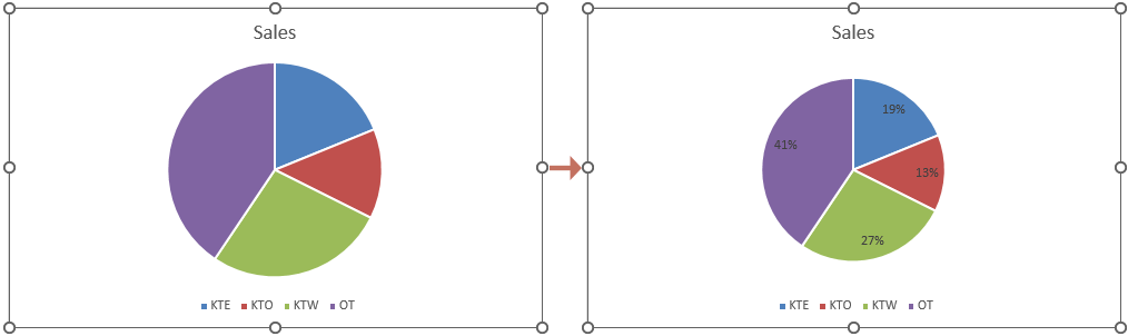
Արդյունք
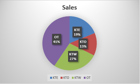
Now percentages are shown in the selected pie chart as shown in the screenshot below.
By following the detailed steps outlined above, you can effectively display percentages in your Excel pie charts, thereby making your data visualizations more informative and impactful. Enhance your reports and presentations by applying these techniques to present data in a more accessible and understandable way. For those eager to delve deeper into Excel's capabilities, our website boasts a wealth of tutorials. Բացահայտեք Excel-ի ավելի շատ խորհուրդներ և հնարքներ այստեղ.
Գրասենյակի արտադրողականության լավագույն գործիքները
Լրացրեք ձեր Excel-ի հմտությունները Kutools-ի հետ Excel-ի համար և փորձեք արդյունավետությունը, ինչպես երբեք: Kutools-ը Excel-ի համար առաջարկում է ավելի քան 300 առաջադեմ առանձնահատկություններ՝ արտադրողականությունը բարձրացնելու և ժամանակ խնայելու համար: Սեղմեք այստեղ՝ Ձեզ ամենաշատ անհրաժեշտ հատկանիշը ստանալու համար...
")
Office Tab- ը Tabbed ինտերֆեյսը բերում է Office, և ձեր աշխատանքը շատ ավելի դյուրին դարձրեք
- Միացնել ներդիրներով խմբագրումը և ընթերցումը Word, Excel, PowerPoint- ով, Հրատարակիչ, Access, Visio և Project:
- Բացեք և ստեղծեք բազմաթիվ փաստաթղթեր նույն պատուհանի նոր ներդիրներում, այլ ոչ թե նոր պատուհաններում:
- Բարձրացնում է ձեր արտադրողականությունը 50%-ով և նվազեցնում մկնիկի հարյուրավոր սեղմումները ձեզ համար ամեն օր:
")